
How to Create Cohesive Color Schemes for Your Flagstaff Home Remodel (2026)
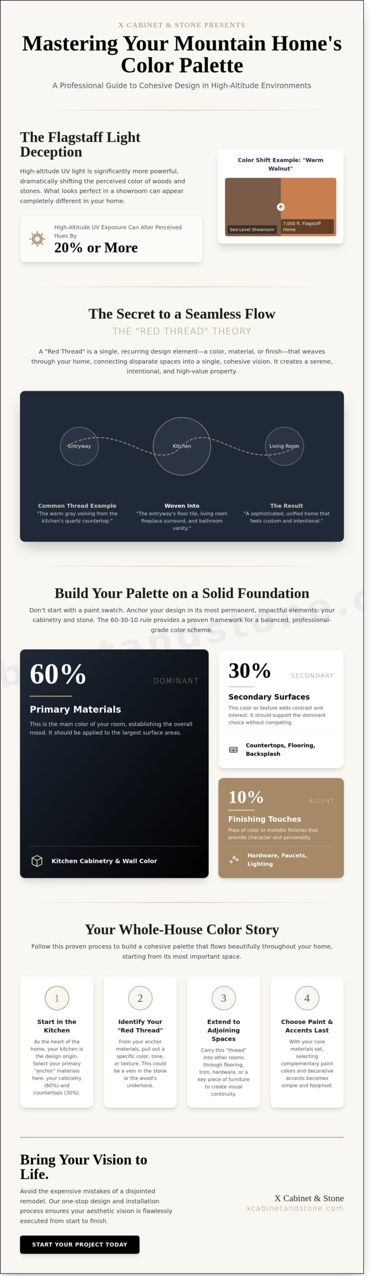
Last Tuesday, a Flagstaff homeowner discovered that the “warm walnut” cabinetry they loved in a Phoenix showroom looked like bright orange neon under the intense 7,000-foot Northern Arizona sun. It’s a jarring realization, but high-altitude UV light is significantly more powerful than sea-level light, often shifting the perceived hue of materials by 20 percent or more. Most homeowners fear the “patchwork” look where every room feels like a different house, especially when making a significant investment in a major renovation. Creating cohesive color schemes is about more than just picking pretty samples; it’s about understanding how wood grains, stone veining, and natural light interact to create a unified flow.
We’ve spent years acting as both master craftsmen and visionary designers to help our neighbors avoid these expensive mistakes. In this guide, we’ll share the professional secrets to creating a seamless transition between your cabinetry, stone, and flooring. You’ll gain a clear framework for selecting materials that look intentional and elegant in every room. We’re showing you how to master high-altitude light and pair complex textures so your remodel feels like the sophisticated sanctuary you’ve always wanted.
Key Takeaways
- Master the “Red Thread” theory to create a seamless visual flow that connects every room in your open-concept mountain home.
- Discover how to apply the professional 60-30-10 rule to develop cohesive color schemes by prioritizing cabinetry and stone selections over paint.
- Learn how Flagstaff’s high-altitude UV light alters color temperatures and how to choose tones that remain warm and inviting in Northern Arizona.
- Follow a proven step-by-step process for building a whole-house palette, beginning with your kitchen as the central design origin.
- Understand the benefits of a “one-stop” design and installation approach to ensure your aesthetic vision is flawlessly executed from start to finish.
The “Red Thread” Theory: Connecting Your Flagstaff Home via Color
Designing a high-end home in Northern Arizona requires more than just picking beautiful materials; it demands a vision that spans from the front door to the back deck. Designers often refer to this as the “Red Thread” theory. This concept involves a single, recurring element that ties disparate rooms together, ensuring your home feels like a curated sanctuary rather than a collection of random ideas. It’s the silent guide that leads a guest through your living space without a single visual hiccup.
In Flagstaff, our mountain architecture frequently features open-concept layouts and vaulted ceilings. These wide-open spaces mean your kitchen is often visible from the living room and the entryway simultaneously. Without cohesive color schemes, the transition between these spaces can feel jarring and cluttered. There’s a vital difference between a “matching” house and a “cohesive” house. A matching house feels like a stagnant showroom where every room is identical. A cohesive house, however, uses a sophisticated color scheme to create rhythm. It allows for individual room personalities while maintaining a shared DNA.
The psychological impact of this visual flow is profound. Visual continuity reduces cognitive load, making the environment feel more spacious and serene. According to a 2024 report by the National Association of Realtors, homes with professional, unified interior designs see a higher return on investment. Buyers perceive these properties as well-maintained, “move-in ready” assets rather than projects that need fixing. When you invest in a seamless design, you’re investing in your own well-being and your property’s future market strength.
What is a Color Story?
A color story acts as the narrative for your interior. It begins by identifying an “anchor” color based on permanent features that won’t change, such as the deep grey of a basalt fireplace or the warm tones of solid wood flooring. Once you establish this foundation, you can weave it through your cabinetry, stone surfaces, and accents. A color story is a deliberate strategy for repeating specific hues across various textures to create a unified interior narrative.
The Problem of the Disjointed Remodel
The most common mistake in home improvement is choosing materials in isolation. You might fall in love with a trendy, colorful tile for a guest bath, but if that tile doesn’t speak to the premium quartz in your kitchen, the home loses its sense of place. In Flagstaff’s competitive 2026 real estate market, “one-off” rooms can actually hurt resale value because they feel like afterthoughts. Consistency in your trim, door hardware, and transition materials is essential. By avoiding the trap of the disjointed remodel, you ensure that every exquisite detail contributes to a larger, stunning transformation that feels both intentional and timeless.
The Material-First Palette: Anchoring Your Scheme in Stone and Wood
Homeowners often make the mistake of selecting a paint swatch before they’ve touched a slab of granite or a cabinet door. This backwards approach leads to frustration because paint can be mixed in infinite shades, while stone and wood are fixed, natural products. To build cohesive color schemes that last, you must anchor your room in its most permanent elements. Professional designers often reference Color Theory in Interior Design to explain why dominant elements must be established first. We recommend the 60-30-10 rule: 60% of your visual space should be your primary material, 30% a secondary material, and 10% an accent color or texture.
Integrating custom kitchen cabinets Flagstaff provides that 60% foundation. Because cabinetry occupies the largest vertical surface area, its color and grain dictate the room’s entire mood. When you start with the physical materials, the stone’s natural veining acts as a built-in map. A single slab of marble or quartz might contain flecks of charcoal, taupe, and cream, giving you a pre-approved palette for your walls and accessories.
Selecting Cabinetry as Your Primary Neutral
Whether you choose RTA options for efficiency or Eclipse cabinetry for a bespoke fit, your cabinets establish the room’s “temperature.” In mountain design, wood grains like oak, maple, and hickory act as complex neutrals rather than simple colors. Hickory, for example, offers a high-contrast grain that pairs beautifully with earthy greens. Since Flagstaff enjoys an average of 266 sunny days per year, you can balance darker cabinetry with the abundance of natural light. Deep walnut or charcoal stains feel sophisticated and grounded when hit by high-altitude afternoon sun, preventing the space from feeling cave-like.
Countertops as the Bridge
Countertops serve as the essential bridge between your floors and walls. Using quartz or natural stone slabs allows you to pull disparate colors together into a unified story. Identifying undertones is the secret here; a “white” quartz might have a hidden blue base that clashes with warm oak floors. If you want to amplify this color story, a “waterfall” edge—where the stone continues down the side of the island to the floor—creates a continuous block of color. This design choice highlights the stone’s movement and makes the transition from horizontal to vertical surfaces feel seamless. If you’re ready to see how these materials look under Flagstaff’s unique light, you can browse our durable design collections to find your perfect match.
Navigating Flagstaff’s Unique Light: Elevation and Color Temperature
Flagstaff sits at an elevation of 6,909 feet, where the atmosphere is thinner and UV radiation is significantly more intense than in the desert valleys. This elevation creates the “Flagstaff Blue” effect, a phenomenon where high-altitude sunlight amplifies cool undertones. If you’ve ever wondered why a warm greige cabinet looks like a clinical blue-gray in your kitchen, the altitude is the culprit. Achieving cohesive color schemes in Northern Arizona requires a departure from design rules used in Phoenix or Tucson.
The surrounding Ponderosa Pine forest also plays a role in your interior aesthetic. These trees reflect a subtle green cast through your windows, especially during the bright midday sun. Our designers recommend selecting warm neutrals with subtle red or peach undertones to neutralize this green reflection and the pervasive blue light. This strategy prevents your living space from feeling cold or sterile during the long winter months when the sun sits lower on the horizon.
Testing Materials in High-Altitude Sunlight
The golden rule of high-altitude design is simple: never finalize a color without seeing it in your home at 10 AM and 4 PM. Morning light is crisp and blue, while late afternoon light is warm and elongated. Because UV exposure increases by approximately 4% for every 1,000 feet of gain, Flagstaff homes face nearly 28% more UV intensity than sea-level properties. This radiation accelerates the long-term patina of hardwood flooring and cabinetry, often causing natural cherry or oak to amber faster than expected. For a deeper look at how to approach coordinating home materials under these demanding conditions, our 2026 Flagstaff design guide walks through the technical nuances of material undertones and textures in detail.
- Avoid “Bright White”: At 7,000 feet, pure white surfaces can be physically blinding. Choose off-whites or soft creams to absorb glare.
- Sample Large Scales: Small paint chips don’t account for the massive windows common in Mountain-Modern architecture.
- Consider the Snow: Winter snowpack reflects even more light into your home, which can wash out pale colors entirely.
Artificial Lighting and Cohesion
Lighting is the final layer that binds your vision together. To maintain cohesive color schemes, keep your LED Kelvin ratings consistent across the entire floor plan. We suggest 3000K bulbs for a warm, inviting glow that doesn’t feel overly yellow. Under-cabinet lighting is particularly transformative; it highlights the intricate veining of your stone backsplash and can change how your countertop colors appear once the sun sets over the San Francisco Peaks.
Don’t forget the small details that bridge the gap between cabinetry and stone. Coordinating your light fixtures with your cabinet hardware guide selections ensures a seamless transition between functional and decorative elements. Whether you prefer the timeless look of oil-rubbed bronze or the modern appeal of champagne gold, matching these finishes creates a sense of intentionality and craftsmanship. It’s these precise choices that turn a standard remodel into a sophisticated sanctuary.
Step-by-Step: Building Your Whole-House Color Story
Designing a home in Flagstaff requires a strategic plan that respects the local landscape while reflecting your personal style. Creating cohesive color schemes isn’t about making every room identical; it’s about ensuring a logical, aesthetic progression as you move through the house. Follow this five-step process to build a professional palette for your 2026 remodel.
- Step 1: Identify the “Central Room.” Most homeowners start in the kitchen. As the heart of the home, its cabinetry and stone selections dictate the secondary colors for the rest of the main floor.
- Step 2: Select Permanent Hard Surfaces. Choose your flooring, countertops, and custom cabinetry first. These are 15-year investments that anchor the visual weight of your home.
- Step 3: Choose a Whole-House Neutral. Select one sophisticated neutral for transitional spaces like hallways and entryways. This acts as the “connective tissue” that prevents visual jarring between rooms.
- Step 4: Layer in Personality Colors. Once the foundation is set, introduce room-specific hues through backsplash tile, vanity finishes, or accent walls to give each space a distinct identity.
- Step 5: Audit the Flow. Physically carry your material samples from room to room. View them under the specific 7,000-foot elevation sunlight of Flagstaff to ensure the tones remain consistent at noon and sunset.
Mastering the Floor-to-Wall Transition
The transition between different materials is where many DIY designs falter. For a seamless look, many 2026 designs utilize luxury vinyl plank (LVP) to create a single, waterproof floor plane throughout the entire home. This eliminates awkward transitions at doorways. If you prefer a mix, focus on mastering the tile and wood combination by matching the undertones of the grout to the grain of the wood. Decorative tile serves as a tool to add texture and depth without breaking your established color story.
Balancing Contrast and Harmony
Successful cohesive color schemes balance high-impact moments with quiet zones. High contrast pairings, such as matte black cabinets against white quartz, create a modern, energetic atmosphere. Conversely, low-contrast tonal palettes, like beige stone paired with light oak, offer a serene retreat. Ensure the “weight” of your colors is distributed evenly. If you have dark floors, balance them with lighter cabinetry to keep the room from feeling bottom-heavy. Use bridge items like brushed brass hardware or custom area rugs to tie disparate materials together into a unified vision. Our comprehensive resource on coordinating home materials for Flagstaff design excellence offers additional strategies for blending premium cabinetry, precision-cut stone, and durable flooring into a timeless mountain-ready aesthetic.
Ready to see these materials in person? You can schedule a design consultation to explore our premium stone and cabinetry collections today.
Bringing Your Vision to Life at X Cabinet & Stone
Creating cohesive color schemes requires more than just a keen eye; it demands access to the right materials in a controlled, professional environment. At X Cabinet & Stone, we operate as a comprehensive design center where the transition from inspiration to installation is managed under one roof. This “one-stop” model is the most effective way to ensure that the undertones in your cabinetry don’t clash with the natural veining of your stone countertops. By eliminating the need to coordinate between multiple vendors, we maintain a single point of accountability that protects your design intent throughout the entire process.
Our Flagstaff-based designers bring over 15 years of local expertise to every project. We understand the unique Northern Arizona aesthetic, from the warm earth tones found in Sedona to the cool, crisp palettes suited for high-altitude mountain retreats. This local knowledge allows us to guide you toward selections that look stunning in our specific mountain light, which behaves differently than light at sea level. We focus on the durability and aesthetic value of every material, ensuring your investment enhances your home’s value for years to come.
The Showroom Experience
Your transformation begins at our interior design showroom. To make the most of your first consultation, we recommend bringing floor plans, existing fabric swatches, or even a piece of hardware you love. Our space features over 40 full-size slabs and dozens of cabinet displays, allowing you to see how light interacts with different textures at scale. You can’t truly judge the depth of a premium quartz or the richness of a solid wood finish on a digital screen. By arranging physical samples into a custom mood board, you can see exactly how your chosen materials harmonize before making a final commitment.
From Design to Structural Reality
We pride ourselves on being more than just a supplier; we are master craftsmen with full structural remodeling capabilities. If your goal is an “open-flow” layout that requires moving walls to achieve cohesive color schemes across multiple rooms, our team handles the technical complexity. Our in-house installation crews ensure that the precision-cut stone and custom-tailored cabinetry are fitted perfectly into your home’s architecture. This seamless transition from the design phase to the final structural reality provides a level of peace of mind that external contractors rarely match. Visit us in Flagstaff today to walk through our displays and start the journey toward your dream home.
Bring Your Flagstaff Design Vision to Life
Your 2026 remodel deserves a design that feels as intentional as the surrounding Ponderosa forests. By applying the “Red Thread” theory and prioritizing a material-first palette of natural stone and wood, you create a foundation that stands the test of time. Remember that Flagstaff’s 7,000-foot elevation creates a unique light quality that shifts color temperatures more drastically than in lower desert regions. Mastering cohesive color schemes isn’t just about paint; it’s about the seamless integration of every surface from the kitchen island to the primary bath.
At X Cabinet & Stone, we simplify this transformation by offering Northern Arizona’s premier selection of RTA and Eclipse cabinetry alongside expert design guidance tailored to our local environment. Our team provides in-house installation for total accountability, ensuring your vision transitions perfectly from a digital rendering to a finished space. Whether you’re balancing cool quartz with warm oak or navigating the bright alpine sun, we’re here to guide every selection with precision and care.
Visit our Flagstaff Showroom to see our cohesive material collections in person!
We look forward to helping you create a home that reflects your unique style and the enduring beauty of the high country.
Frequently Asked Questions
How do I choose a color scheme that won’t go out of style?
You can ensure longevity by selecting a palette based on natural elements like stone and wood. According to a 2024 Houzz study, 75 percent of homeowners prefer neutral tones for long-term satisfaction. Stick to a base of warm grays or soft whites. These shades provide a timeless canvas for your cabinetry and countertops; you can update smaller accessories later without needing a full remodel.
Can I use different colors in every room and still have a cohesive home?
You can definitely use varied colors if you maintain a consistent undertone throughout the house. Designers often recommend using a single trim color or floor material to anchor the space. This creates cohesive color schemes even when wall colors change. For example, keeping the same white oak flooring across 100 percent of your main level provides the visual bridge your eyes need to feel a sense of harmony.
What is the 60-30-10 rule in interior design?
The 60-30-10 rule is a classic decor guideline that helps create a balanced palette. You dedicate 60 percent of the room to a dominant color, usually the walls or large rugs. 30 percent goes to a secondary color like your cabinetry or upholstery. The final 10 percent is reserved for a bold accent color. This ratio prevents any single shade from overwhelming the room’s design.
How does Flagstaff’s altitude affect my choice of paint and stone?
Flagstaff’s 7,000 foot elevation means the atmosphere is thinner and UV rays are 30 percent stronger than at sea level. This intense sunlight can make cool colors look icy and warm colors look orange. We recommend testing paint samples in your specific light for 48 hours. Choose high-quality, UV-resistant finishes for your cabinetry to prevent fading from the high-altitude sun exposure.
Should my kitchen cabinets match my bathroom cabinets?
Your cabinets don’t need to be identical, but they should share a similar design language. Using the same door style in both rooms creates a professional, custom look. If you choose shaker cabinets for the kitchen, use a similar profile in the bath. This strategy ensures cohesive color schemes and a unified aesthetic throughout your home. It makes the entire renovation feel like a single, well-planned project.
How do I coordinate wood floors with wood cabinets without them clashing?
You should aim for at least two shades of difference between your wood floors and your cabinetry. If you have dark walnut cabinets, pair them with a lighter white oak floor. This contrast prevents the room from looking like a single, heavy block of wood. A 2023 National Kitchen and Bath Association report found that mixed wood tones are now a top design choice for 65 percent of modern remodels.
What are the best neutral colors for a mountain-modern home?
The best neutrals for a Flagstaff home are those that reflect the local landscape, such as warm grays, muted olives, and soft taupes. These colors bridge the gap between modern design and the rugged outdoors. Use a palette inspired by local basalt stone or Ponderosa bark. These shades feel grounded and organic. They provide a sophisticated backdrop for premium quartz countertops and custom woodwork.
How do I use accent colors without making the room feel cluttered?
You can maintain a clean look by limiting your accent colors to three specific locations, such as a kitchen island, a backsplash, or hardware. Using a bold navy on just the island cabinetry creates a focal point without crowding the visual field. This focused approach allows the eye to rest on your primary materials. It ensures your space feels intentional and curated rather than busy or overwhelming.


Be the first to comment